Website Design for Small Businesses

WHAT DO WE DO?
We design your website to be as unique as your business. We never use templates and NEVER use Wordpress.
Your very own writer. Making sure the important messages come across and you are indexed on Google
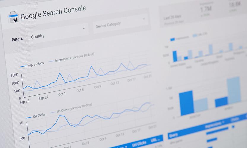
SEO included. Your website is designed to be found and ranked by Search engines.
ARE WE ANY GOOD?


I have been running my own small business for the last 21months, unfortunately my current website wasn't attracting enough traffic. I started to look for a professional website design company to create a new website without breaking the bank. After speaking to 3 compainies I decided Dotgo was the right company to build my new website, no hard sale, no blinding me with technical data just listening to the reasons why I wanted a new website. Once I had transferred the money the process was quick and easy, Dotgo were very slick and efficient in arranging a web designer, then a web writer drafted the first version within three days. I was sent the first draft via email in a word document. It was explained clearly this was a word document, which needed to be accurate but not complete, once I had viewed and fedback my thoughts the script writer does his magic. Once the magic content has been approved by me the web designer creates the first draft and shares it via a Zoom meeting. This is my opportunity to view and feedback to the web designer. There were a few minor changes required and to be honest the response from the web designer was fantastic, not a problem even removing a section and adding another section, which wasn't mentioned in the first two sessions. It was a quick turn around after the changes, I was delighted with the end result. Dotgo swapped my URL from my previous company to their own, the transition was seamless, although my company email wasn't playing ball, an IT expert sorted it out very quickly. Every person I spoke with at Dotgo were fantatic and a real pleasure to work with. I can highly recommend Dotgo services their attention to detail was second to none, which resulted in a fantastic website. The customer service doesn't end there continual support is only a phone call away. Well done Dotgo a first class service at a very reasonable price.
They were very approachable and eager to assist with our vision of what we wanted for our new website. The process was very straightforward and easy. The end results have exceeded our expectations and would absolutely recommend DotGo to anyone.
Thank you Faith and Tom and all at DotGO. Building the website with such experienced and creative support has been invaluable. The whole process has been really interesting and I would highly recommend them.
Great team that produced a fantastic product that kept up clear communication scheduled round our busy work days. Big thanks to Faith and the team
Great communication and very helpful, made it a breeze.
Professional prompt did exactly what I ask if fact wen extra mile could not ask for anymore looking forward to the future with website
Excellent from start to finish, Luke explained everything along the way as we built the stages to completion, I now have a very smart website up and running
My experience with DotGo was fluid and consistent and there was no break in communication, which is rather refreshing. They kept to their schedule and we were led through the process every step of the way, which is really helpful if you are not familiar with the process. It was a hassel free process if you work with them and provide them with the information they require, you can sit back and wait for the results! Awesome! Stress free process. I do recommend them.
From first contact everyone was friendly helpful and professional. Nothing was too much trouble. I would definitely recommend DotGo..
From start to finish its been an amazing experience! Luke is a legend to work with, he designed my website exactly the way I wanted it. Always on time with calls and emails. Hes been so understanding through the whole process and the end result of my website speaks volumes in terms of his expertise in design! Wow!!!! Thank you so much for one awesome website!
Excellent service, professional, sleek, excellent communication and a FABULOUS website. Thank you Faith and Josh!
Working with DotGO has been an absolute pleasure. From the initial consultation to the final website launch, the entire process was smooth, professional, and exceeded my expectations. Luke - my website designer and the team’s expertise and dedication to their craft were evident at every stage, and I couldn't be happier with the results. The DotGO way process made everything so easy and straightforward. I felt supported and guided throughout, and the communication was exceptional. The website they built for my business reflects exactly what I envisioned, and I am truly thrilled with the outcome. I highly recommend DotGO to anyone in need of a professional, user-friendly, and visually stunning website. Their service is top-notch, and the value they provide is incomparable. I am confident that the website they have created for my business will be an invaluable asset for years to come. Thank you Luke, DotGO, for your outstanding work and for making the entire experience so positive. I am truly grateful for your dedication and expertise. It has been a pleasure working with you, and I am excited about the future of my business with this incredible website in place.
WHAT DOES IT COST?
How much does a business website cost to build and manage?

Affordable, beautiful, focused website
£199+vat
£39 per month
| Webpages | 2+ |
|---|---|
| Timing | ~2 wks |
| Design service |
|
| Bespoke |
|
| Google SEO |
|
| Branding/logo | |
| Blog writing | |
| Ecommerce |

Customised website, designed with passion
£499+vat
£39 per month
| Webpages | Many |
|---|---|
| Timing | 4-6 weeks |
| Design service | |
| Bespoke | |
| Google SEO | |
| Branding/logo |
|
| Blog writing |
|
| Ecommerce |

Everything you need to be successful online
£999+vat
£39 per month
| Webpages | Many+ |
|---|---|
| Timing | 4-8 weeks |
| Design service | |
| Bespoke | |
| Google SEO | |
| Branding/logo | |
| Blog writing | |
| Ecommerce |

Full ecommerce website with all features
£699+vat
£55 per month
| Webpages | Many |
|---|---|
| Timing | 4-8 weeks |
| Design service | |
| Bespoke | |
| Google SEO | |
| Branding/logo | |
| Blog writing | |
| Ecommerce |
Prices do not include VAT
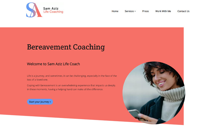
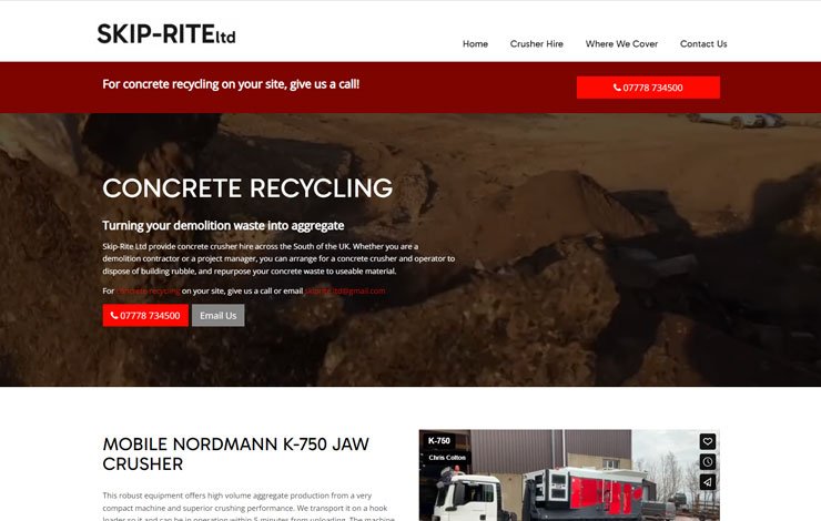
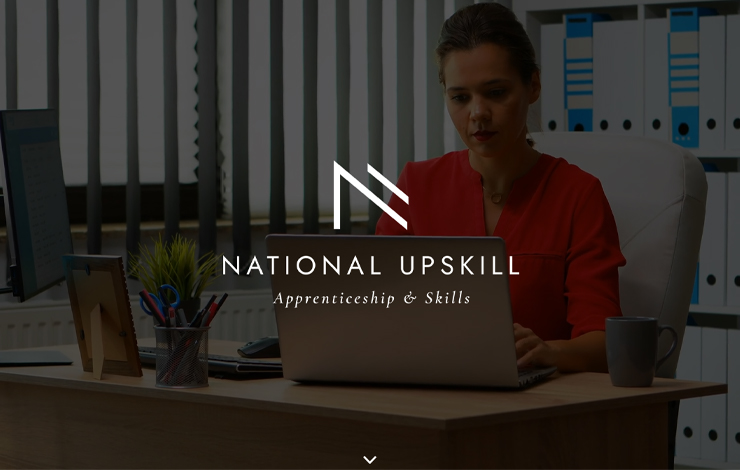
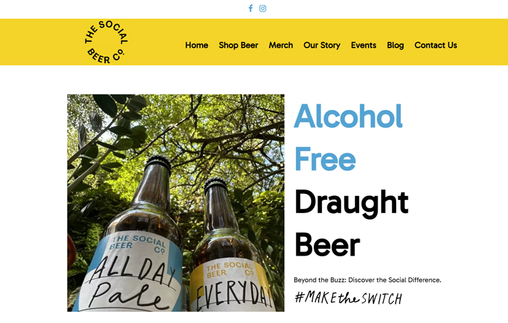
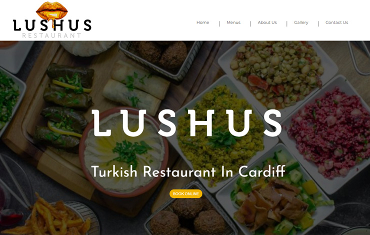
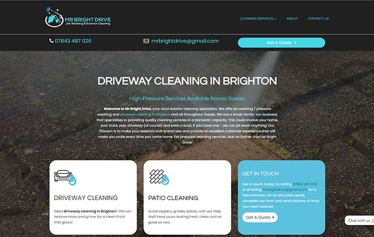
RECENT EXAMPLES
Website type
Full personalised quote
HOW DO WE DO IT?
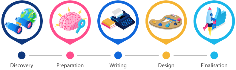
We call it the DotGO way
A web design process like no other
DO WE BUILD SHOPS?
We build it - you run it .
Once your shop is ready, we design and give you a dedicated 1:1 training session. We introduce you to all the tools you'll need and send you a full recording of the training session.
Add your products and automatically manage and track your stock as you sell online and offline.
Offer your customers the option to pay with PayPal, Credit or Debit Cards.
Marketing
Latest post
Tips and Tricks
Latest post
Ecommerce
Latest post
There's nobody else quite like us

and be the best you can be online.


